
In this lesson, you will learn how to update a screen with Android Studio and JetPack Compose. Jetpack Compose is Android’s modern toolkit for building native UI. It simplifies and accelerates UI development on Android bringing your apps to life with less code, powerful tools, and intuitive Kotlin APIs.

User interface
User interface for a Compose Android app is built as a hierarchy of components.
-
The layouts can be viewed as containers that control how their child views are positioned on the screen.
-
UI components such as buttons and text boxes…
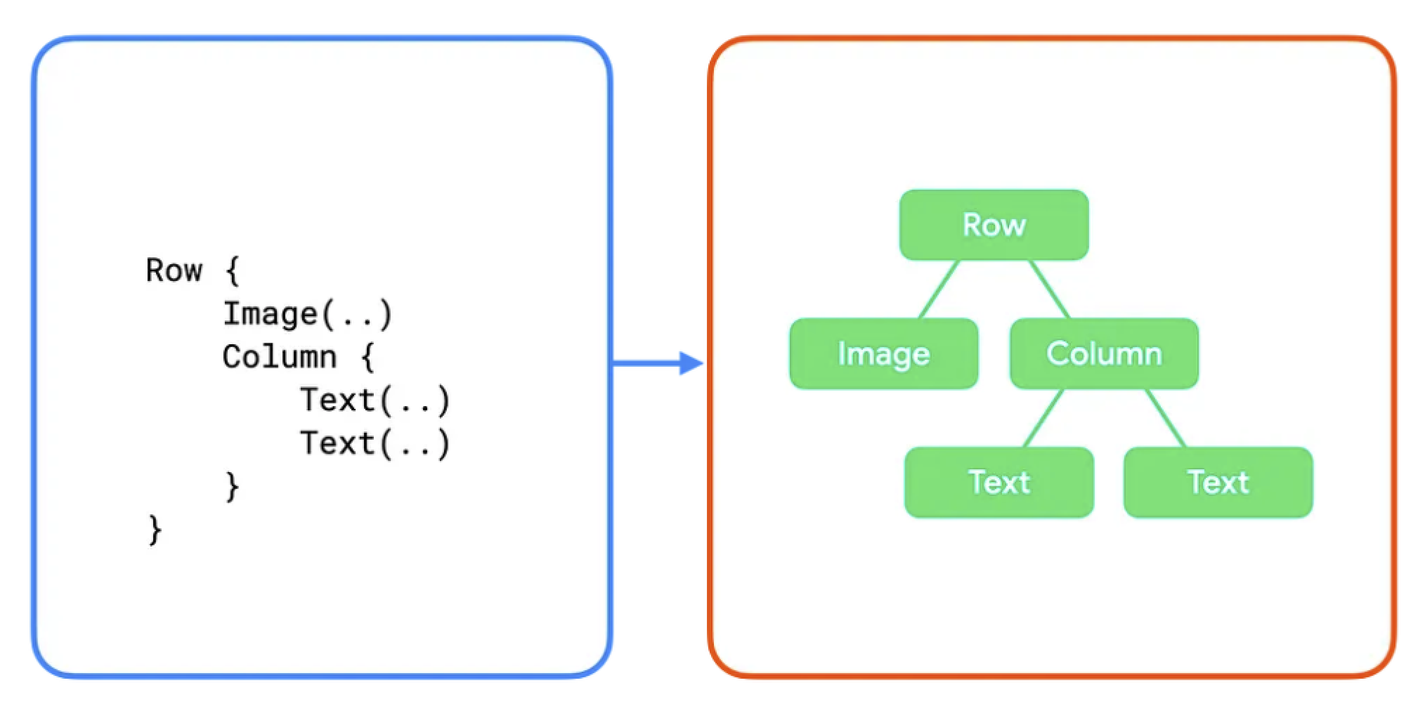
Image credit https://developer.android.com/
Add a component
In the generated example you have seen a first example with the Greeting component.
@Composable
fun Greeting(name: String, modifier: Modifier = Modifier) {
Text(
text = "Hello $name!",
modifier = modifier
)
}We will edit it and add some text
@Composable
fun Greeting(name: String, modifier: Modifier = Modifier) {
Text(
text = "Hello $name!",
modifier = modifier
)
Text(
text = "I learn to create a new app",
modifier = modifier
)
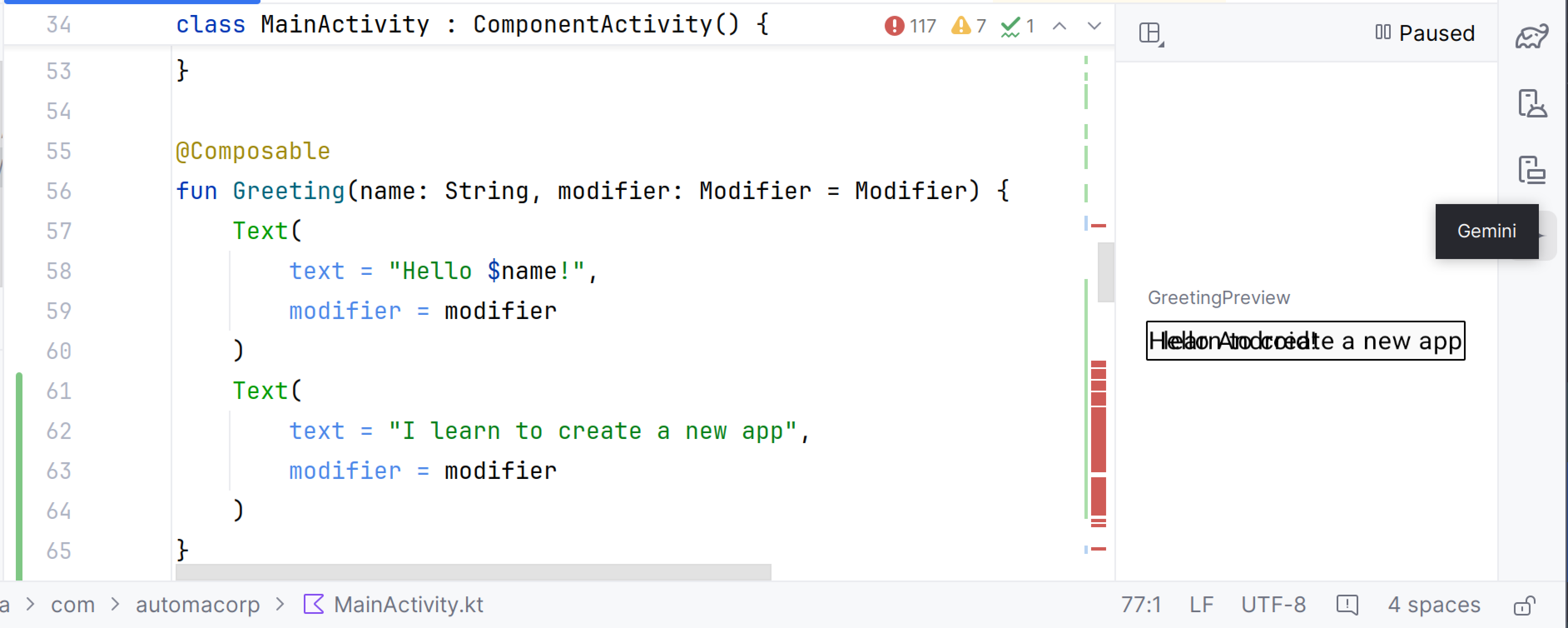
}This code creates two text elements inside the content view. However, since you haven’t provided any information about how to arrange them, the text elements are drawn on top of each other, making the text unreadable.
Use a layout
To arrange components, you can use a layout. In Compose, layouts are composable functions that define the structure of the UI.
-
The Column function lets you arrange elements vertically.
-
The Row function lets you arrange elements horizontally.
-
and Box to stack elements.
You can find more layout in the official documentation
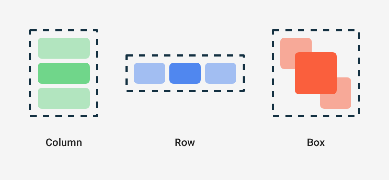
Image credit https://developer.android.com/
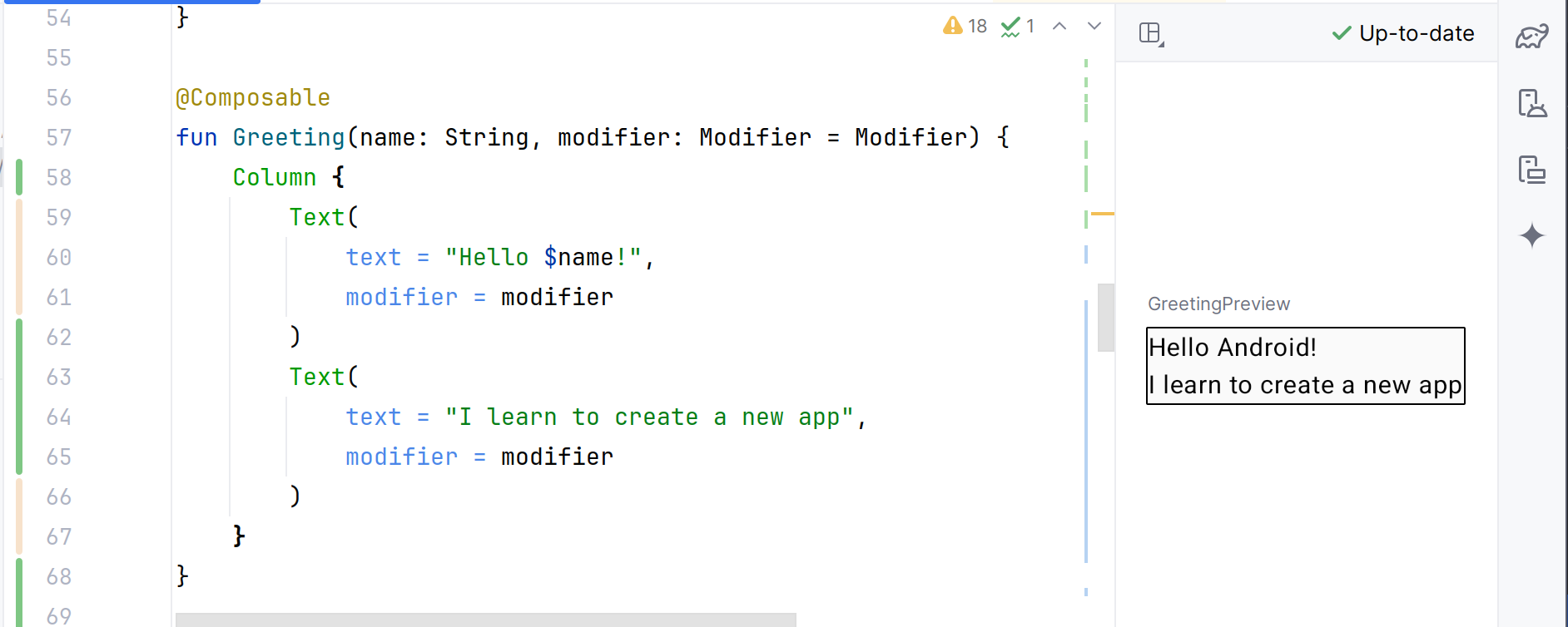
Resolve the problem by using a Column layout
Component isolation
With Compose, you create small, stateless components that aren’t associated with any specific activities or fragments. This makes them easy to reuse and test.
In Compose, state must be explicit and passed to the composable. This way, there is only one source of information for state, making it encapsulated and decoupled. Then, when the application state changes, your UI is automatically updated.
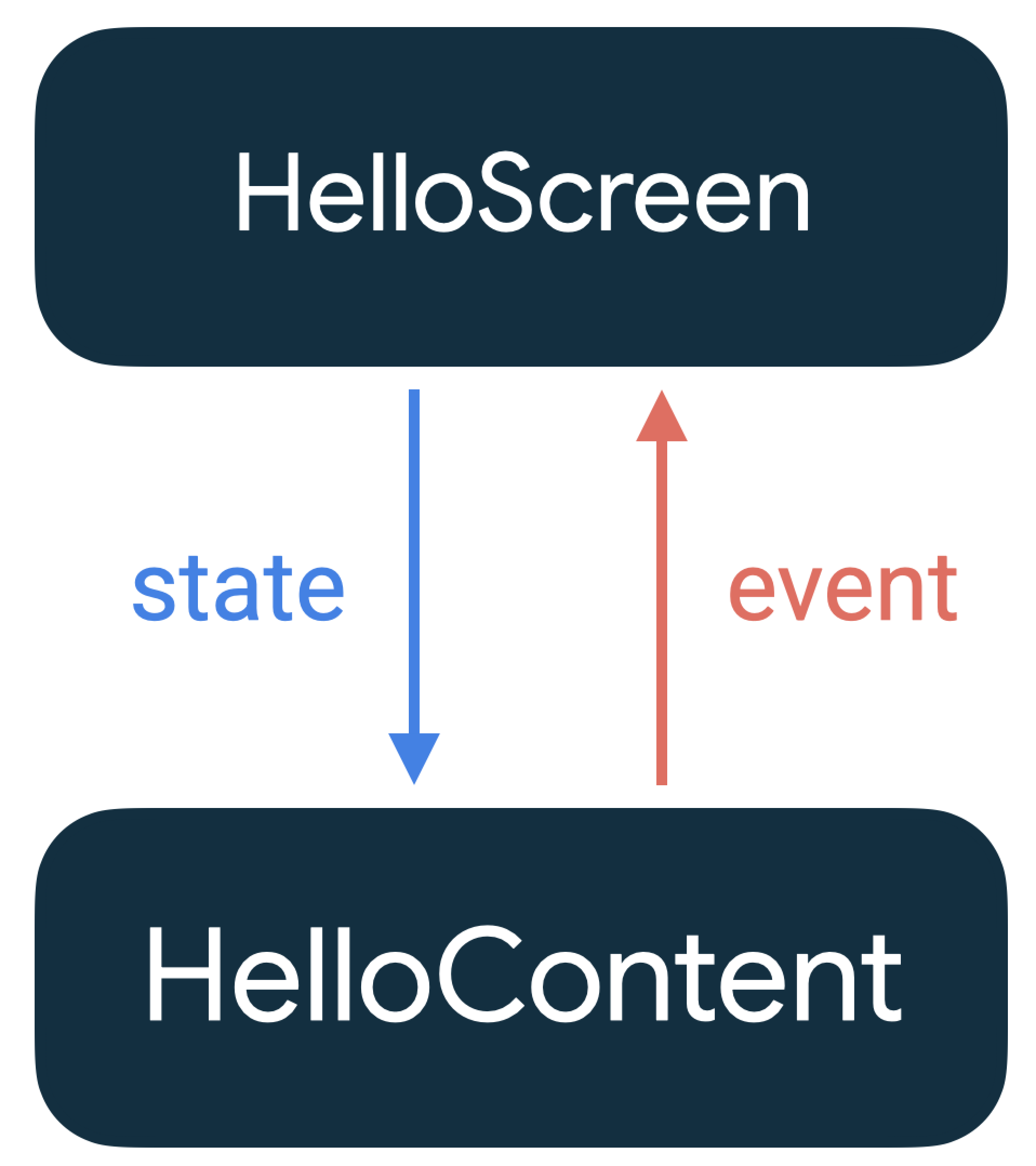
Image credit https://developer.android.com/
For example if we add a button to our layout, we have to define what to do when the button is clicked.
@Composable
fun Greeting(name: String, modifier: Modifier = Modifier) {
Column {
Text(
text = "Hello $name!",
modifier = modifier
)
Button(onClick = {}) {
Text(
text = "My first button",
modifier = modifier
)
}
}
}We can’t call or modify the state in a composable. So the onclick must not be managed locally. You have to pass it as an argument.
@Composable
fun Greeting(name: String, onClick: () -> Unit, modifier: Modifier = Modifier) {
Column {
Text(
text = "Hello $name!",
modifier = modifier
)
Button(onClick = onClick) {
Text(
text = "My first button"
)
}
}
}And in the caller (in the activity or fragment) you can define the action to do when the button is clicked.
class MainActivity : ComponentActivity() {
override fun onCreate(savedInstanceState: Bundle?) {
super.onCreate(savedInstanceState)
val onButtonClick: () -> Unit = {
// Here you can access to the activity state (ie baseContext)
Toast.makeText(baseContext, "Hello button", Toast.LENGTH_LONG).show()
}
setContent {
AutomacorpTheme {
Scaffold(modifier = Modifier.fillMaxSize()) { innerPadding ->
Greeting(
"Android",
onClick = onButtonClick,
modifier = Modifier.padding(innerPadding),
)
}
}
}
}
}When Jetpack Compose runs your composables for the first time, during initial composition, it will keep track of the composables that you call to describe your UI in a Composition. Then, when the state of your app changes, Jetpack Compose schedules a recomposition. Recomposition is when Jetpack Compose re-executes the composables that may have changed in response to state changes, and then updates the Composition to reflect any changes.
Compose will avoid recomposing them if their inputs haven’t changed.
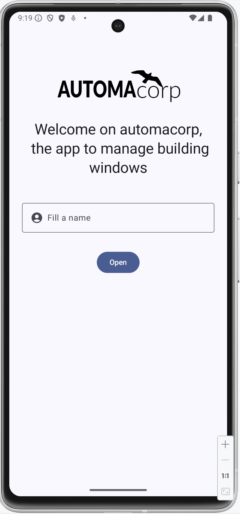
 : Update the home page
In this new codelab you will update the greeting page to create a home page with
-
a welcome message (
Textcomposable), -
an image (
Imagecomposable), -
an edit text (
OutlinedTextFieldcomposable, we will use a placeholder with an icon) and -
a button (
Buttoncomposable).
We will create
Update the greeting text
Update the Greeting composable and the Text component to display this message Welcome on automacorp the app to manage building windows.
You can test your work, but this solution is not optimal. If you want to provide your app to people who speak different languages you must to use the Android solution to internationalize the text.
Resources are the additional files and static content that your code uses, such as images, screen definitions, strings used in interfaces, styles, animation instructions, and more. At runtime, Android uses the appropriate resource based on the current configuration.
For example, you can define different string files depending on user language.
-
app/src/main/res/values/string.xml the default file
-
app/src/main/res/values-fr/string.xml the file for French language
Open the Project window and open file app > res > values > strings.xml. This is a string resources file, where you can specify all of your UI strings. It allows you to manage all of your UI strings in a single location, which makes them easier to find, update, and localize. For the moment you have only one text inside, your app name.

You can launch Translations Editor, to add or edit text for different languages (link on the top). In this lab we will use only one language. You can update this file and add these values
<resources>
<string name="app_name">automacorp</string>
<string name="app_logo_description">automacorp logo</string>
<string name="act_main_welcome">Welcome on automacorp,
the app to manage building windows</string>
<string name="act_main_open">Open</string>
<string name="act_main_fill_name">Fill a name</string>
</resources>Update your Text definition to use the stringResource to use a 18n key in your code. For example
Text(
stringResource(R.string.act_main_welcome),
textAlign = TextAlign.Center
)Add an image
We will add an image on the first screen on the top. Copy this xml file ic_logo.xml in your directory _res > drawable. This file is a vector drawable image. Directory drawable contains all your images. Several formats are available (png, jpg…) but the most optimized is a Vector drawable
We can create a new composable to manage this image. The API force to define an image text description for accessibility
@Composable
fun AppLogo(modifier: Modifier) {
Image(
painter = painterResource(R.drawable.ic_logo),
contentDescription = stringResource(R.string.app_logo_description),
modifier = modifier.paddingFromBaseline(top = 100.dp).height(80.dp),
)
}The modifier is an argument because the position will be defined by the parent. If you want to reuse this composable elsewhere, this modifier (the property to display your block) can be different.
Now you can use this new composable in the Greeting block in a Column layout to have the image above the text
@Composable
fun Greeting(onClick: (name: String) -> Unit, modifier: Modifier = Modifier) {
Column {
AppLogo(Modifier.padding(top = 32.dp).fillMaxWidth())
Text(
stringResource(R.string.act_main_welcome),
style = MaterialTheme.typography.headlineMedium,
modifier = Modifier
.padding(24.dp)
.align(Alignment.CenterHorizontally),
textAlign = TextAlign.Center
)
}
}Add a text to fill a name
TextField allows users to enter and modify text. We will use an OutlinedTextField to use a different style.
For the moment we will try to write a text in the console (note: the modifier is used to define the position of the component)
OutlinedTextField(
"",
onValueChange = { println("value of the field : $it") },
modifier = Modifier.padding(24.dp).fillMaxWidth()
)If you try to display the field and write a text, you will see that nothing happens. That’s because the TextField doesn’t update itself when its value parameter changes. This is due to how composition and recomposition work in Compose. When you update something in the field, the composable is recomposed and redisplayed. But the value of the field is lost.
We need to store the value of the field in a state with the remember function. Compose provides a way to store the state of the application in a composable. You can use the mutableStateOf function to create a mutable state.
Update your code to define a state for the text field, and update it when the value is updated by the user
var name by remember { mutableStateOf("") }
OutlinedTextField(
name,
onValueChange = { name = it },
modifier = Modifier.padding(24.dp).fillMaxWidth()
)But when you open the screen, the input value is empty. We can use a placeholder to display a text when the field is empty. We can use a placeholder argument to define a composable to display when the field is empty. The content of the placeholder can be a complex composable. For example, we can display an icon and a text.
OutlinedTextField(
name,
onValueChange = { name = it },
modifier = Modifier.padding(24.dp).fillMaxWidth(),
placeholder = {
Row {
Icon(
Icons.Rounded.AccountCircle,
modifier = Modifier.padding(end = 8.dp),
contentDescription = stringResource(R.string.act_main_fill_name),
)
Text(stringResource(R.string.act_main_fill_name))
}
})The Icons class is a collection of icons provided by the Material Design library.
You can relaunch your app and test the text field.
Add a button
We will add a button to display the filled name in the previous OutlinedTextField, in a floating dialog box. On the Button composable, the onClick argument is used to define the action to do when the button is clicked.
But we can’t call the showDialog function in the composable. We have to pass the onClick function as an argument.
@Composable
fun Greeting(onClick: (name: String) -> Unit, modifier: Modifier = Modifier) {
Column {
// ...
var name by remember { mutableStateOf("") }
OutlinedTextField(
name,
onValueChange = { name = it },
modifier = Modifier.padding(24.dp).fillMaxWidth(),
placeholder = {
Text(stringResource(R.string.act_main_fill_name))
})
Button(
onClick = { onClick(name) },
modifier = Modifier.padding(8.dp).align(Alignment.CenterHorizontally)
) {
Text(stringResource(R.string.act_main_open))
}
}
}In the MainActivity class, you can define the action to do when the button is clicked. For example, you can display a message with the name filled in the text field.
class MainActivity : ComponentActivity() {
override fun onCreate(savedInstanceState: Bundle?) {
super.onCreate(savedInstanceState)
// Action to do when the button is clicked
val onSayHelloButtonClick: (name: String) -> Unit = { name ->
Toast.makeText(baseContext, "Hello $name", Toast.LENGTH_LONG).show()
}
setContent {
AutomacorpTheme {
Scaffold(modifier = Modifier.fillMaxSize()) { innerPadding ->
Greeting(
onClick = onSayHelloButtonClick,
modifier = Modifier.padding(innerPadding),
)
}
}
}
}
}You can now relaunch your app, fill the text field, and click on the button to see the message displayed.
Conclusion
In this lesson, you have learned how to update a screen with Android Studio and JetPack Compose. You have learned how to create a new component, use a layout to arrange components, and manage the state of a component. You have also learned how to use resources to manage text and images in your app.
If you want to go further, you can see the official documentation to learn more about the Compose API.