We will learn how to structure a page by adding a menu (top or bottom), a main action and a title. For this we will use the composable Scaffold

Scaffold
The Scaffold composable provides an API you can use to quickly assemble your app’s structure according to Material Design guidelines. Scaffold accepts several composables as parameters
-
topBar: The app bar across the top of the screen.
-
bottomBar: The app bar across the bottom of the screen.
-
floatingActionButton: A button that hovers over the bottom-right corner of the screen that you can use to expose the main action of your screen.
Floating action button
The floating action button (FAB) is a primary action button that typically appears in the bottom-right corner of the screen. It’s used for a promoted action, such as creating a new item.
In Material Design, there are four types of FAB:
-
FAB: A floating action button of ordinary size.
-
Small FAB: A smaller floating action button.
-
Large FAB: A larger floating action button.
-
Extended FAB: A floating action button that contains more than just an icon.

Image credit https://developer.android.com/
 : Use a floating action button to update our room
You can add a floating action button to your app by using the FloatingActionButton composable.
For that we will create a new composable RoomUpdateButton
@Composable
fun RoomUpdateButton(onClick: () -> Unit) {
ExtendedFloatingActionButton(
onClick = { onClick() },
icon = {
Icon(
Icons.Filled.Done,
contentDescription = stringResource(R.string.act_room_save),
)
},
text = { Text(text = stringResource(R.string.act_room_save)) }
)
}This button can be declared in the Scaffold composable as a parameter floatingActionButton
class RoomActivity : ComponentActivity() {
override fun onCreate(savedInstanceState: Bundle?) {
super.onCreate(savedInstanceState)
enableEdgeToEdge()
val param = intent.getStringExtra(MainActivity.ROOM_PARAM)
val room = RoomService.findByNameOrId(param)
val onRoomSave: () -> Unit = {
// ...
}
setContent {
AutomacorpTheme {
Scaffold(
floatingActionButton = { RoomUpdateButton(onRoomSave) },
modifier = Modifier.fillMaxSize()
) { innerPadding ->
if (viewModel.room != null) {
RoomDetail(room, Modifier.padding(innerPadding))
} else {
NoRoom(Modifier.padding(innerPadding))
}
}
}
}
}
}But we have a problem with the action. We have no way to access to value of the different fields to update a name or the target temperature of a room. We used a state but this state is defined locally in the RoomDetail composable. We need to move this state in the RoomActivity and define a global state. For that we need to use a ViewModel
View model
Why use a ViewModel ?
A ViewModel is a class that is responsible for preparing and managing the data for an Activity or a Fragment. It also handles the communication of the Activity / Fragment with the rest of the application (e.g. calling the business logic classes).
The Android framework manages the lifecycle of UI controllers, such as activities and fragments. The framework may decide to destroy or re-create an UI controller in response to certain user actions or device events that are completely out of your control.
If the system destroys or re-creates an UI controller, any transient UI-related data you store in them is lost. For example, your app may include a list of users in one of its activities. When the activity is re-created for a configuration change, the new activity has to re-fetch the list of users.
For simple data, the activity can use the onSaveInstanceState() method and restore its data from the bundle in onCreate(), but this approach is only suitable for small amounts of data that can be serialized then deserialized, not for potentially large amounts of data like a list of users or bitmaps.
Another problem is that UI controllers frequently need to make asynchronous calls that may take some time to return. The UI controller needs to manage these calls and ensure the system cleans them up after it’s destroyed to avoid potential memory leaks.
ViewModels were created to resolve these problems and separate out view data ownership from UI controller logic. UI controllers such as activities and fragments should only display UI data, react to user actions, or handle operating system communication, such as permission requests. The data should be now managed by a ViewModel.
Using a view model helps enforce a clear separation between the code for your app’s UI and its data model.

The ViewModel class is used to store data related to an app’s UI, and is also lifecycle aware, meaning that it responds to lifecycle events much like an activity or fragment does. If lifecycle events such as screen rotation cause an activity or fragment to be destroyed and recreated, the associated ViewModel won’t need to be recreated. We will use a ViewModel to store the state of our room.
Create a ViewModel
To create a model, you need to create a class that extends the ViewModel class. This class will contain the data that you want to store and manage. In our case we will store our composable state.
class RoomViewModel: ViewModel() {
var room by mutableStateOf <RoomDto?>(null)
}You can then use this ViewModel in your activity or fragment.
val param = intent.getStringExtra(MainActivity.ROOM_PARAM)
val viewModel: RoomViewModel by viewModels()
viewModel.room = RoomService.findByNameOrId(param) : Use a floating action button
You can now finish the implementation of the floating action button. You can use the ViewModel to update the room.
Update the RoomDetail composable signature to accept a RoomViewModel as parameters.!
fun RoomDetail(model: RoomViewModel, modifier: Modifier = Modifier) {
Column(modifier = modifier.padding(16.dp)) {
Text(
text = stringResource(R.string.act_room_name),
style = MaterialTheme.typography.labelSmall,
modifier = Modifier.padding(bottom = 4.dp)
)
OutlinedTextField(
value = model.room?.name ?: "",
onValueChange = { model.room?.name = it },
label = { Text(text = stringResource(R.string.act_room_name)) },
modifier = Modifier.fillMaxWidth()
)
// ...
}
}When you update something in the RoomDetail composable, the handler can access now to the room data and update the data. After the saving you can return to the home with an Intent
val onRoomSave: () -> Unit = {
if(viewModel.room != null) {
val roomDto: RoomDto = viewModel.room as RoomDto
RoomService.updateRoom(roomDto.id, roomDto)
Toast.makeText(baseContext, "Room ${roomDto.name} was updated", Toast.LENGTH_LONG).show()
startActivity(Intent(baseContext, MainActivity::class.java))
}
} Create our images for the menu
We will create 3 images for our future menu topbar from svg downloaded from my website.
For each image follow these steps
-
Download the image (right click on the image and save as)
-
In the Project window, select the Android view.
-
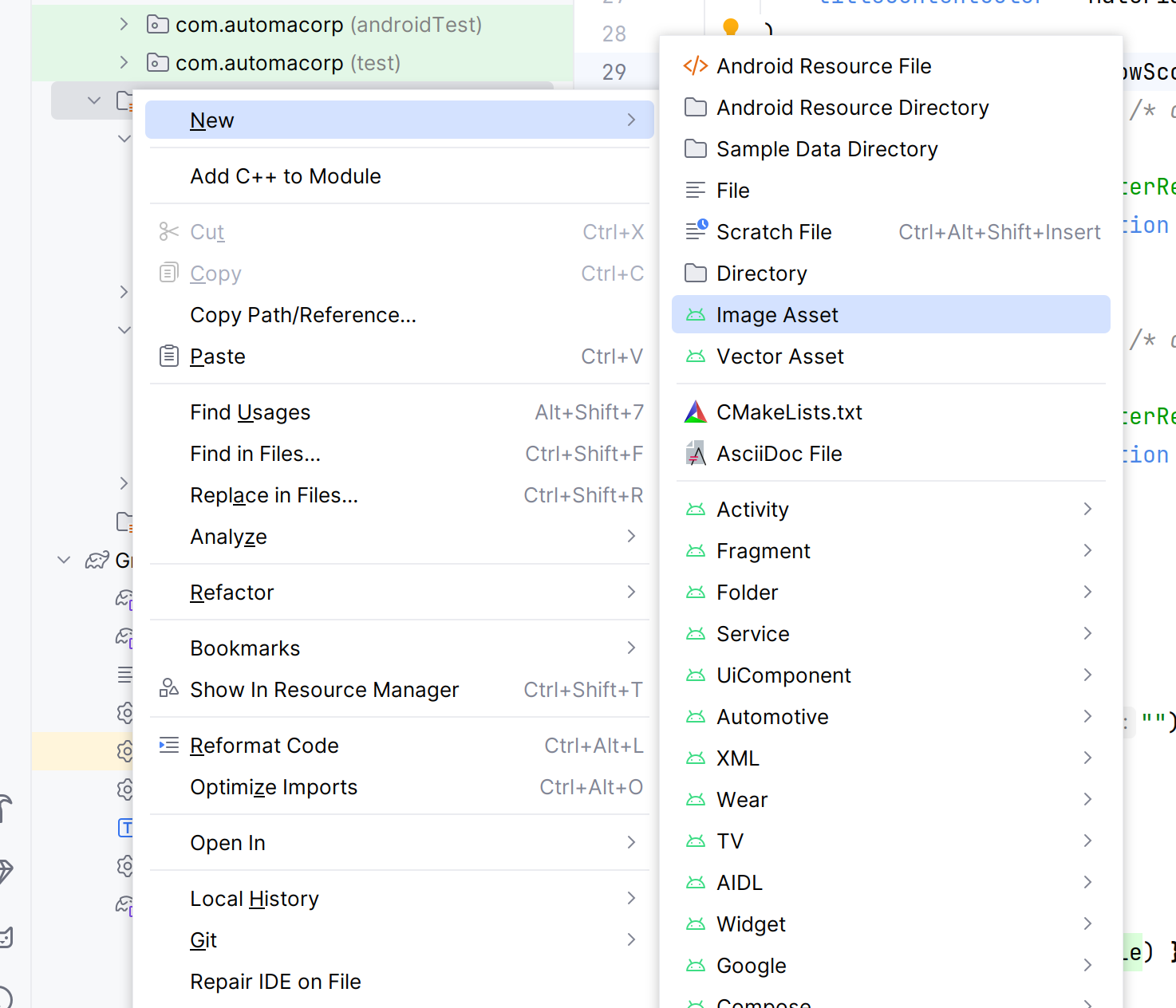
Right-click the res folder and select New > Image Asset
-
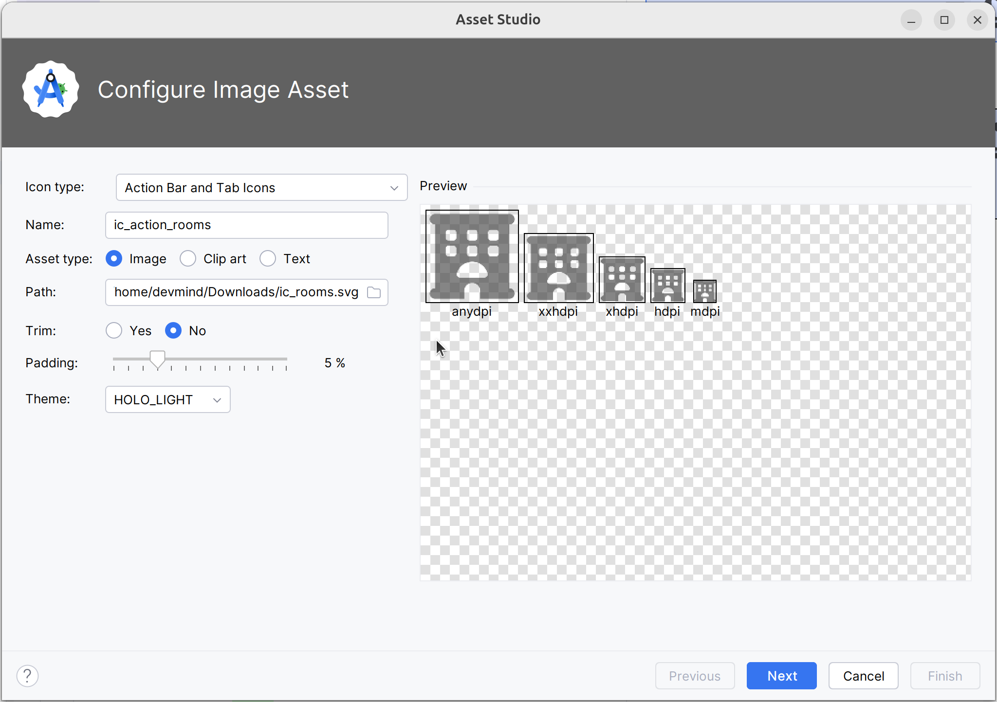
In the Configure Image Asset dialog, select Action Bar and Tab Icons in the Icon Type field. On the path select the downloaded image
-
Click Next and Finish
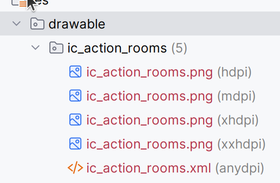
You should now have 5 images generated in the res/drawable/ic_actions_rooms folder (one for each screen density)
Repeat these steps for each image (mail and github).
App menu
With the Scaffold composable you can add a menu in the top or in the bottom bar.
-
A top bar is a bar that appears at the top of the screen. It provides access to key tasks and information. It generally hosts a title, core action items, and certain navigation items.
-
A bottom bar is a bar that appears at the bottom of the screen. It typically includes core navigation items. It may also provide access to other key actions, such as through a contained floating action button.

Image credit https://developer.android.com/
The top bar can have different organization depending on the screen.
| Type | Example |
|---|---|
Small : |
|
Center aligned : |
|
Medium : |
|
Large : |
|
Image credit https://developer.android.com/
The various composables that allow you to implement the four different top app bars share several key parameters:
-
title: The text that appears across the app bar.
-
navigationIcon: The primary icon for navigation. Appears on the left of the app bar.
-
actions: Icons that provide the user access to key actions. They appear on the right of the app bar.
-
scrollBehavior: Determines how the top app bar responds to scrolling of the scaffold’s inner content.
-
colors: Determines how the app bar appears.
 : Create a common menu in your app
Create String resources for the menu items in the res/values/strings.xml file
<string name="app_go_back_description">Go back</string>
<string name="app_go_room_description">Rooms</string>
<string name="app_go_github_description">Github</string>
<string name="app_go_mail_description">Send email</string>As we want to share the menu between different activities, we will create composable in its own Kotlin file.
Create a file named AutomacorpMenu.kt in the package com.automacorp
@Composable
@OptIn(ExperimentalMaterial3Api::class)
fun AutomacorpTopAppBar(title: String? = null, returnAction: () -> Unit = {}) {
val colors = TopAppBarDefaults.topAppBarColors(
containerColor = MaterialTheme.colorScheme.primaryContainer,
titleContentColor = MaterialTheme.colorScheme.primary,
)
// Define the actions displayed on the right side of the app bar
val actions: @Composable RowScope.() -> Unit = {
IconButton(onClick = { /* do something */ }) {
Icon(
painter = painterResource(R.drawable.ic_action_rooms),
contentDescription = stringResource(R.string.app_go_room_description)
)
}
IconButton(onClick = { /* do something */ }) {
Icon(
painter = painterResource(R.drawable.ic_action_mail),
contentDescription = stringResource(R.string.app_go_mail_description)
)
}
IconButton(onClick = { /* do something */ }) {
Icon(
painter = painterResource(R.drawable.ic_action_github),
contentDescription = stringResource(R.string.app_go_github_description)
)
}
}
// Display the app bar with the title if present and actions
if(title == null) {
TopAppBar(
title = { Text("") },
colors = colors,
actions = actions
)
} else {
MediumTopAppBar(
title = { Text(title) },
colors = colors,
// The title will be displayed in other screen than the main screen.
// In this case we need to add a return action
navigationIcon = {
IconButton(onClick = returnAction) {
Icon(
imageVector = Icons.AutoMirrored.Filled.ArrowBack,
contentDescription = stringResource(R.string.app_go_back_description)
)
}
},
actions = actions
)
}
}
@Preview(showBackground = true)
@Composable
fun AutomacorpTopAppBarHomePreview() {
AutomacorpTheme {
AutomacorpTopAppBar(null)
}
}
@Preview(showBackground = true)
@Composable
fun AutomacorpTopAppBarPreview() {
AutomacorpTheme {
AutomacorpTopAppBar("A page")
}
}Adapt this composable to your needs. We will see how to add intents in the next chapter.
With the @Preview annotation, you can see a preview of your composable in the Android Studio preview window.
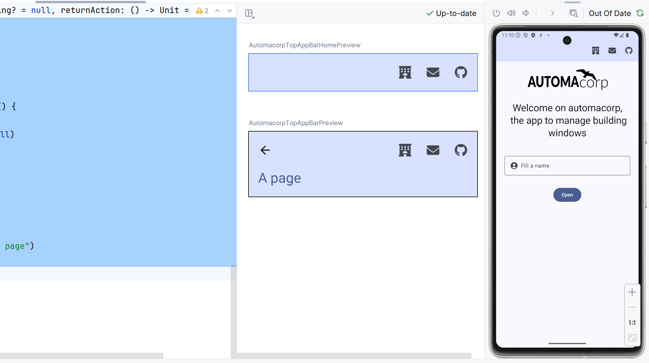
 : Use yout topbar in the screens
You can nox use your topbar in your screens. For example, update the RoomActivity to use the AutomacorpTopAppBar composable.
setContent {
AutomacorpTheme {
Scaffold(
topBar = { AutomacorpTopAppBar("Room", navigateBack) },
floatingActionButton = { RoomUpdateButton(onRoomSave) },
modifier = Modifier.fillMaxSize()
) {
// ...
}
}To write the navigateBack function, you can use this code for example.
val navigateBack: () -> Unit = {
startActivity(Intent(baseContext, MainActivity::class.java))
}You can now use the AutomacorpTopAppBar composable in all your activities.
 : Intent : new use case
I introduced the Intent concept in this chapter. In the first menu item we call another activity in our app, as we already done in the lab "Add a new activity".
An intent is an abstract description of an operation to be performed. It can be used to launch an Activity, a background Service… And you can call one activity in your app or in another app installed on the device. In this case you ask to the system to find the best application to resolve an action.
The first argument for the Intent is the expected action, such as ACTION_VIEW, ACTION_SENDTO, ACTION_EDIT, ACTION_MAIN, etc.
The second one is the data to operate on, such an URL, an email, expressed as a Uri.
Some examples of action/data pairs :
-
ACTION_VIEWcontent://contacts/people/1 : Display information about the person whose identifier is "1". -
ACTION_DIALtel:0642434445 : Display the phone dialer with the given number filled in. -
ACTION_EDITcontent://contacts/people/1 : Edit information about the person whose identifier is "1". -
…
For example you can create an intent to open a web page in the default browser
val intent = Intent(Intent.ACTION_VIEW, Uri.parse("https://dev-mind.fr"))
startActivity(intent)You can also create an intent to send an email
val intent = Intent(Intent.ACTION_SENDTO, Uri.parse("mailto://guillaume@dev-mind.fr"))
startActivity(intent)Update the AutomacorpTopAppBar composable to add the intents to the different actions.
-
The first action will open the
RoomListActivityactivity. For that create a new empty activityRoomListActivity -
The second action will send an email to your email address
-
The third action will open your Github page
If you have an error when you try to send an email, you should check that you have an email client installed on your virtual or real device. If not you can launch Google Play Store to install an email client as Gmail.


